
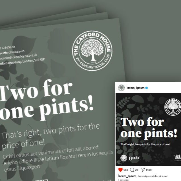
The Catford House branding released
- Oct 27, 2025
- 1 min read
Updated: Oct 29, 2025

"Timeless, elegant, clean and memorable," just a few of the adjectives used to describe our new logo and branding package.
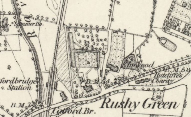
The tree at the centre of the design references the rural origins of The Catford House, which was originally built in the 1730's as a farmhouse called the Elmwood. You can see it clearly marked on this map of the area which dates back to 1863. The builder, Nelgarde Doggett, is remembered in the nearby streets which bear his name.

The new Catford House logo is circular, which speaks of community and inclusivity - a modern social space which can be enjoyed by everyone and is welcoming to all - not just a house, but a home. The dark green/grey ties in with the mood of the pub interior, which picks up on the idea of bringing the outside in and makes the most of the original Georgian features. Take a look at the mood boards below to get a clear feel for the new space.


Designer Darren Lomon says, "Whether on external signage, beer mats, headed paper, T-shirts or tiny thumbnails, the logo is distinctive and legible. It ties in nicely with the leaves used in the rest of the branding and the plants that will feature both inside and outside the pub itself."

Here's to enjoying that first pint in just a few weeks time!


Comments